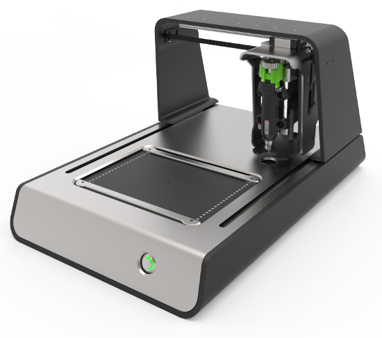
Every year we help to bring hundreds of unique product ideas to life, so we’ve learned a few things about what it takes to create successful products. Some of the designs we’ve worked on have been recognized at robotics competitions, as innovative smart home solutions, and as international design winners.
You can learn a lot about how to refine your own designs by studying some of the winners of the most recent Red Dot Design Awards in Germany, one of the most prestigious competitions in the world. We want to shine a spotlight on a few of the Best of the Best winners for 2018. We hope these will inspire you on your next product design journey.
Mira Prism
The Mira Prism is not the only augmented reality visor out there, but it has some clever innovations that set it apart.
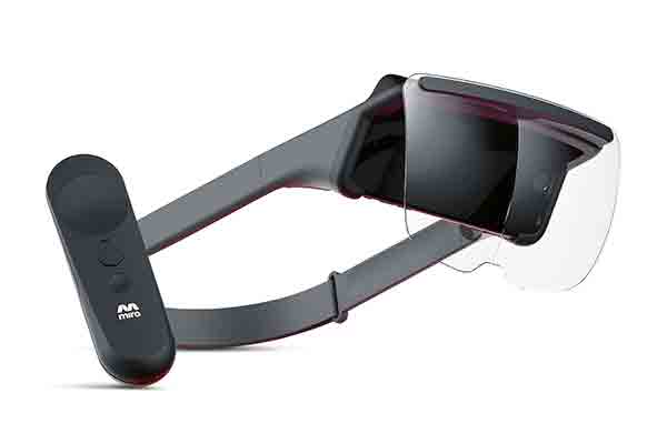
The Mira Prism augmented reality visor has attracted a lot of investor attention.
A slim, minimalist form factor allows you to to wear them over your own spectacles or safety glasses. A smartphone is the engine of the system, providing the camera and the hands-free voice control. Just load Mira’s proprietary software app into your phone and you’re ready to go. Lightweight, comfortable and by using technology you already own it’s cheaper than other solutions. This is a great example of keeping a design clean, simple and reduced to its essentials.
Air Selfie
Another design winner that’s powered by a smartphone app, the Air Selfie is so ultralight and portable you can take it anywhere.
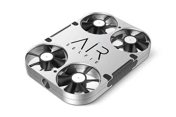
The lightweight, portable Air Selfie is controlled by your smartphone
The anodized, aircraft aluminum case weighs in at less than 3 oz. The Air Selfie has a wide-angle 12MP camera and four rechargeable rotors to effortlessly launch it more than 20 meters over your head for great shots of you and your friends. Easily charges up from any powerbank or a computer cable. It even generates its own wi-fi signal, and fits into your pocket. Easy to use and safe, the Air Selfie can float into your open hand without danger.
We like the high-quality materials, thin case and rounded profile. Some drones can look intimidating but this design is friendly and portable.
Google Home
According to Juniper Research, smart speakers will be installed in a majority – 55% – of U.S. households by 2022. One of the challenges for an industrial designer therefore is to make them easy to live with.
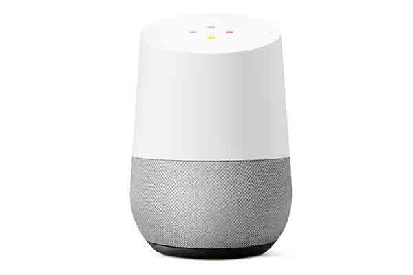
The Google Home comes in different colors to suit your home decor.
The jurists at Red Dot liked the Google Home partly because it has no obtrusive buttons or switches. All functions are controlled via a touchpad on the top, accented with Google’s recognizable and friendly color scheme. It blends with any decor, and the slanted top suggests someone (or something) paying attention.
If you’re going to make a smart, hands-free device, make sure you don’t need hands to use it. The clean interface belies the underlying technology, which is currently able to work seamlessly with over 5,000 connected devices. (And counting.)
NIO Power Home
NIO is a Chinese electric car startup with big plans for the rest of the world. With offices in Asia, Europe and the U.S., they appear serious about great engineering and great design.
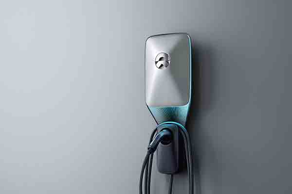
Recharging arm for NIO electric vehicles
Eventually all electric cars will need to be plugged in, but instead of using a functional but clunky charging adapter, the NIO opted to create this very slick and futuristic magic wand. High-end materials and a luminous finish are meant to invoke a sense of premium quality – exactly the upscale market that NIO is aiming for.
A great way to reinforce your brand is to ensure that the smallest details of every product reflect your company image, and this example nails it.
Kaffeeform
Every day around the world more than 2 billion cups of coffee are consumed. And that means, every day, vast amounts of coffee grounds are generated and then just thrown away. But product designer Julian Lechner of Berlin had a better idea.
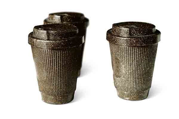
Coffee cups made from coffee grinds.
After several years of trial and error, he created Kaffeeform, an eco-friendly solution. Coffee grounds are collected, dried, compacted and then combined with a natural resin to form a solid. This new material is reusable, non-toxic, carbon-neutral, dishwasher safe and easily recycled. Every cup is unique and they even smell like, well, coffee.
We hope that this clever repurposing of “waste” will inspire other product developers to find clever uses for raw material that others may have overlooked.
Logiblocs
There’s something about this product that just makes you want to play with it, which just proves how successful this design is.
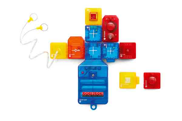
Logiblocs are safe, colorful and infinitely expandable.
The Logiblocs educational toy from 4M inspires young people to learn how to create functional electrical circuits. Different components are color-coded by function (switches, buzzers, relays, etc.) and snap together in myriad ways to create limitless electronic devices. Translucent cases show the working innards, while the rounded profiles and textured surfaces are easy and safe to grip even for small hands. They also make good use of simple, universal graphics printed onto each component that help to teach basic schematics.
We are big supporters of toys and games that inspire a love for STEAM learning. Logiblocs do just that and invite experimentation for boys and girls.
Ready To Create Your Own Award Winner?
All of these winning products came about through a careful process of ideation, testing, prototyping, and refinement on their way to becoming the best of the best. We’re recognized experts at helping customers go from a great idea to a great finished product. Start yours now by uploading your CAD files for a free quotation.
Chris Williams is the Content Editor at Michigan CNC Machining Parts, Inc.. He is passionate about writing and about developments in science, manufacturing and related technologies. He is also a certified English grammar snob.

